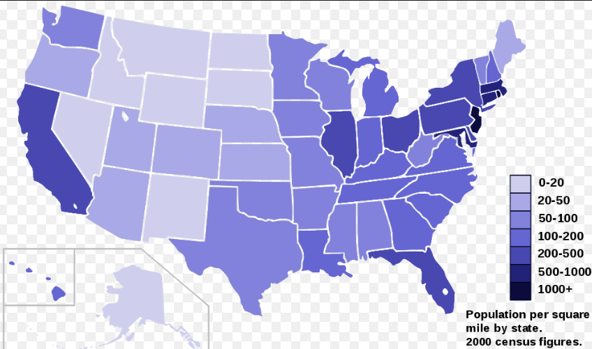
There are many ways to share information and ways to represent data. Example: if you want to share information about how many people live in all the states of then USA, you can create a table like this:
Table data visualisation
State number of inhabitants
NewYork | 100
Texas | 90
California | 80
Infographic data visualisation
You could also create an picture or Infographic with the same data, that might look like this: